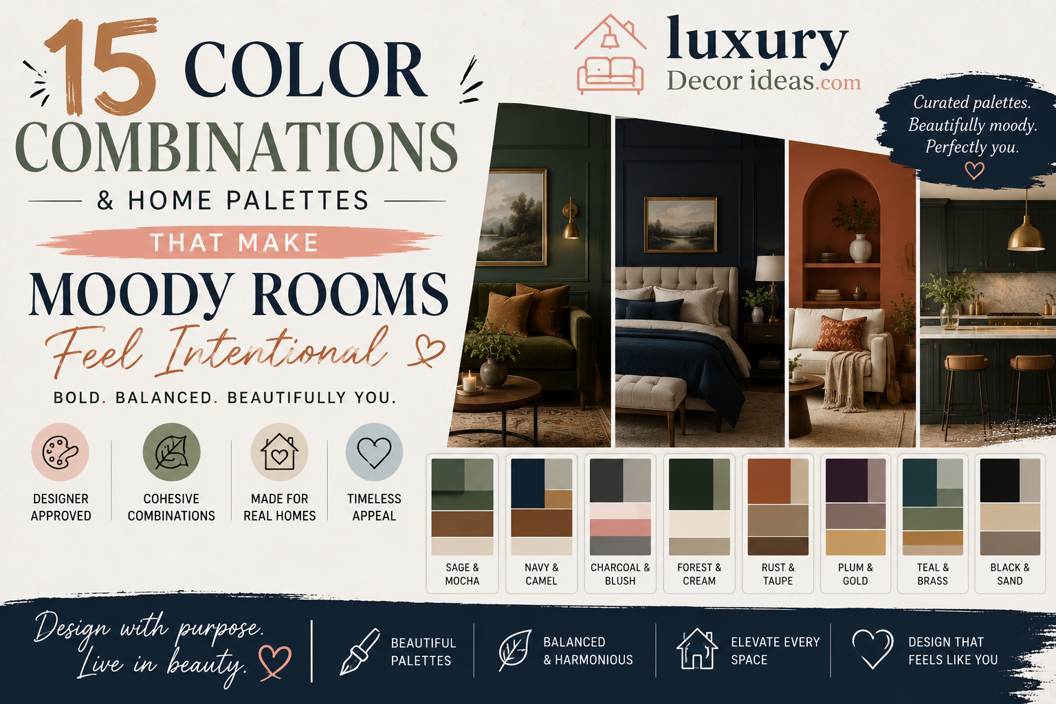
There is a certain kind of magic that happens when you walk into a moody room done right. The lighting feels warmer, the textures feel richer, and the whole space wraps around you like a favorite sweater. But there is also a fine line between a moody room that feels intentional and cozy, and one that simply feels dark and unfinished.
The secret almost always comes down to color combination. Moody design is not about slapping on the darkest paint you can find and calling it a day. It is about layering deep, rich tones with the right undertones, textures, and accent colors so the space feels curated rather than accidental. If you have been wanting to embrace deeper, more dramatic colors in your home but worry about getting it wrong, this guide is exactly what you need.
Let us dim the lights a little and dive into fifteen color combinations that make moody rooms feel absolutely intentional. 🕯️🖤
Why Moody Colors Are Having Such a Major Design Moment 🌙
For years, bright white walls dominated home design trends. But lately, homeowners and designers alike have been embracing depth, drama, and warmth instead.
🌟 Deep colors create a cozy, enveloping atmosphere that feels intimate rather than cold 🌟 Moody palettes photograph beautifully, which has fueled their popularity across social media 🌟 Rich tones hide everyday imperfections and wear better than stark white walls over time 🌟 Dark colors pair beautifully with warm lighting, creating a restaurant like ambiance at home 🌟 Moody rooms tend to feel more sophisticated and grown up compared to trend chasing bright palettes
The key to success lies entirely in thoughtful color pairing. Let us walk through the combinations that consistently deliver stunning, intentional results.
What Makes a Moody Palette Feel Intentional Rather Than Dark and Dreary 🔑
Before jumping into specific combinations, it helps to understand a few guiding principles behind successful moody design.
🕯️ Warm undertones matter. Even deep colors should carry a hint of warmth, whether through a red, brown, or green undertone, to avoid feeling flat or cold.
✨ Contrast creates depth. Pairing a dark base color with lighter or metallic accents keeps the eye moving and prevents the room from feeling like a single dark box.
🪵 Texture is essential. Wood tones, woven textiles, and matte versus glossy finishes all add richness that flat color alone cannot achieve.
💡 Lighting changes everything. Warm, layered lighting is non negotiable in a moody room, since harsh overhead lighting can make deep colors feel harsh rather than inviting.
Keep these principles in mind as you explore the fifteen palettes below.
1. Deep Forest Green and Warm Brass 🌲
This combination pairs a rich, deep forest green wall color with warm brass hardware, light fixtures, and accents. The result feels grounded, natural, and quietly luxurious.
🍃 This palette works beautifully in home libraries, dining rooms, or cozy living spaces.
2. Charcoal Gray and Terracotta 🧱
Charcoal walls paired with warm terracotta accents through textiles, pottery, or accent furniture create a sophisticated yet earthy balance between cool and warm tones.
🏺 This pairing feels particularly at home in a modern bohemian inspired living room.
3. Navy Blue and Warm Gold 💙
A timeless combination, deep navy walls paired with warm gold accents through lighting, frames, or decorative objects create a rich, elegant, almost jewel box like atmosphere.
✨ This palette is a favorite for formal dining rooms or sophisticated home offices.
4. Espresso Brown and Cream 🤎
Deep espresso brown tones balanced with soft, warm cream accents create a cozy, enveloping palette that feels both moody and inviting rather than heavy.
☕ This combination works wonderfully in bedrooms, offering a genuinely restful, cocoon like feel.
Comparison Table of Moody Palette Combinations 🧾
| Palette | Base Color | Accent Color | Best Room |
|---|---|---|---|
| Forest and Brass | Deep forest green | Warm brass | Library, dining room |
| Charcoal and Terracotta | Charcoal gray | Terracotta | Living room |
| Navy and Gold | Navy blue | Warm gold | Dining room, office |
| Espresso and Cream | Espresso brown | Warm cream | Bedroom |
| Plum and Blush | Deep plum | Soft blush | Bedroom, powder room |
| Black and Warm White | Matte black | Warm white | Kitchen, entryway |
| Burgundy and Olive | Deep burgundy | Muted olive | Living room |
5. Deep Plum and Soft Blush 💜
This combination might sound bold on paper, but a deep, muted plum paired with soft, dusty blush accents creates a surprisingly romantic and moody atmosphere that feels intentional rather than overpowering.
🌸 This palette works beautifully in bedrooms or powder rooms looking for a touch of drama.
6. Matte Black and Warm White ⚫
For a more modern moody approach, matte black walls or cabinetry paired with warm, creamy white accents create striking contrast without feeling harsh or cold.
🖤 This combination is especially popular in kitchens and entryways seeking a bold, sophisticated statement.
7. Deep Burgundy and Muted Olive 🍷
Rich burgundy walls balanced with muted, earthy olive accents create a warm, autumnal palette that feels both moody and grounded in nature.
🍂 This combination shines particularly well in living rooms or dens with plenty of natural wood furniture.
8. Slate Blue and Warm Camel 🩶
Slate blue, a color that sits somewhere between gray and blue, pairs beautifully with warm camel tones through leather furniture or woven textiles, creating a balanced, masculine leaning moody palette.
🛋️ This combination works particularly well in home offices or masculine styled living rooms.
9. Deep Teal and Dusty Rose 🩵
An unexpected but stunning combination, deep teal walls paired with dusty rose accents create a rich, jewel toned palette that feels artistic and deeply intentional.
🌹 This pairing works beautifully in bedrooms or creative studio spaces looking for a distinctive, memorable look.
10. Warm Chocolate and Sage Green 🍫
Chocolate brown walls balanced with muted sage green accents create an earthy, organic moody palette that feels calm and deeply grounded.
🌿 This combination pairs beautifully with natural wood furniture and abundant greenery throughout the room.
Full Summary Table of All 15 Palettes 📋
| Number | Palette Name | Mood | Best Use |
|---|---|---|---|
| 1 | Forest and Brass | Grounded luxury | Library, dining room |
| 2 | Charcoal and Terracotta | Earthy sophistication | Living room |
| 3 | Navy and Gold | Elegant drama | Dining room, office |
| 4 | Espresso and Cream | Cozy warmth | Bedroom |
| 5 | Plum and Blush | Romantic depth | Bedroom, powder room |
| 6 | Black and Warm White | Bold modernity | Kitchen, entryway |
| 7 | Burgundy and Olive | Autumnal warmth | Living room, den |
| 8 | Slate Blue and Camel | Balanced masculinity | Home office |
| 9 | Teal and Dusty Rose | Artistic richness | Bedroom, studio |
| 10 | Chocolate and Sage | Organic calm | Living room |
| 11 | Ink Blue and Ivory | Serene depth | Bedroom |
| 12 | Rust and Charcoal | Warm industrial | Living room, loft |
| 13 | Deep Green and Black | Dramatic elegance | Dining room |
| 14 | Mauve and Espresso | Soft sophistication | Bedroom |
| 15 | Bronze and Deep Navy | Refined richness | Study, office |
11. Ink Blue and Ivory 🖋️
A deep, almost black leaning ink blue paired with soft ivory accents creates a serene yet dramatic palette that feels both moody and calming at the same time.
🌊 This combination is especially soothing in bedrooms designed for rest and relaxation.
12. Rust and Charcoal 🔥
Warm rust tones paired with cool charcoal accents create a striking industrial yet cozy balance, perfect for lofts or modern living rooms wanting a bit of edge alongside warmth.
🏭 This palette pairs particularly well with exposed brick, leather furniture, and metal accents.
13. Deep Green and Black 🖤
Combining deep, almost black forest green with true black accents creates one of the most dramatic and elegant moody palettes on this list, ideal for formal dining rooms or statement powder rooms.
🍾 This combination feels luxurious and intentional, especially when paired with brass or gold hardware.
14. Mauve and Espresso 💗
Soft, dusty mauve tones balanced against deep espresso brown furniture or accents create a surprisingly sophisticated, softly moody palette perfect for bedrooms.
🤎 This pairing offers warmth and softness without leaning too sweet or overly feminine.
15. Bronze and Deep Navy 🌌
Deep navy walls paired with warm bronze accents through lighting, hardware, or decorative objects create a refined, almost celestial feeling palette perfect for a study or home office.
📚 This combination pairs beautifully with dark wood furniture and leather bound books for a classic, intellectual atmosphere.
How to Test a Moody Color Before Committing 🖌️
Choosing a deep, dramatic color for your walls can feel intimidating, so testing thoroughly before committing is essential.
🎨 Paint large sample swatches, at least two feet by two feet, on multiple walls to see how the color shifts throughout the day 💡 Observe the color under both natural daylight and your home’s evening lighting setup 🕐 Live with the sample for at least a few days before making a final decision 📸 Take photos of the sample in different lighting conditions to compare more objectively later 🧵 Bring in your intended textiles and accent colors to see how everything works together in person
Skipping this testing phase is one of the most common reasons moody color choices end up feeling regrettable rather than intentional.
Lighting Tips for Moody Rooms 💡
Since lighting plays such a critical role in how moody colors read within a space, keep these tips in mind.
🕯️ Layer multiple light sources, including ambient, task, and accent lighting, rather than relying on a single overhead fixture 💛 Choose warm toned bulbs, generally in the range of 2700 to 3000 kelvin, to enhance rather than wash out deep colors 🌟 Use dimmer switches wherever possible to adjust the mood throughout the day and evening 🪞 Incorporate reflective surfaces like mirrors or metallic accents to help bounce warm light around the room 🕰️ Consider how the room will be used at different times of day when planning your lighting layout
Thoughtful lighting is often the difference between a moody room that feels cozy and one that feels simply dim.
Balancing Texture Within a Moody Palette 🧶
Color alone is not enough to make a moody room feel complete. Texture plays an equally important role in creating depth and visual interest.
🪵 Incorporate natural wood tones to add warmth and organic texture against deep painted walls 🧵 Layer textiles like velvet, wool, and linen to create tactile richness throughout the space ✨ Mix matte and glossy finishes to prevent the room from feeling visually flat 🪴 Add greenery to introduce a living, organic element that softens deep color palettes 🖼️ Use varied frame finishes and artwork textures to add subtle dimension to gallery walls
A well balanced mix of texture ensures your moody palette feels rich and layered rather than one dimensional.
Frequently Asked Questions ❓
Will a moody color make my room feel smaller? Not necessarily. While deep colors can create a more intimate feeling, proper lighting, reflective accents, and thoughtful furniture placement can prevent a room from feeling cramped.
What is the best room to start experimenting with moody colors? Powder rooms, dining rooms, and home offices are popular starting points since they are often used for shorter periods of time, making a dramatic color choice feel less risky.
Do moody colors work in small apartments? Yes, even small spaces can successfully incorporate moody colors, particularly in accent walls or smaller rooms like bathrooms, where the drama feels intentional rather than overwhelming.
How do I keep a moody room from feeling too dark? Balancing deep base colors with warm accent tones, layered lighting, and varied texture all help keep moody rooms feeling rich and inviting rather than simply dark.
Are moody color palettes a passing trend? While specific shades may shift in popularity over time, the broader appeal of rich, warm, intentional color palettes has remained a consistent thread throughout design history, suggesting real staying power.
Final Thoughts 💭
Moody rooms, when done thoughtfully, offer something that bright, neutral spaces often cannot achieve, a genuine sense of warmth, depth, and intentional atmosphere. By pairing deep base colors with the right warm accents, layered lighting, and rich texture, you can create a space that feels curated, cozy, and completely your own.
Whether you gravitate toward the elegant drama of navy and gold, the earthy warmth of chocolate and sage, or the bold sophistication of matte black and warm white, these fifteen color combinations offer a solid foundation for bringing intentional moodiness into your home. Trust the process, test your colors thoroughly, and get ready to fall in love with a deeper, richer version of your favorite rooms. 🕯️🎨